
I was sitting in #NASCOURT today, listening to John Probst, EVP and Chief Racing Development Officer’s testimony, where he said that in connection with their initial planning for the NextGen car, NASCAR contracted with Lixar1, a Canadian technology advisory business, to understand what makes a good race. They utilized fan sentiment, timing, and scoring data to answer this question. They said that NASCAR was asking the wrong question; that a good race was not necessarily an entertaining race, and that fans tended to think a race was good when a popular driver led every lap and won the race, and not think it was good if an unpopular driver won the race but there were many lead changes.
For a few years, I’ve wanted to look at the correlations between Jeff Gluck‘s Good Race Poll and other data; this sounds like as good a time as any. So I gathered the GRP data from every NextGen points race, and aggregated several metrics available from lap timing data. I also found every winner in that time period’s Twitter and Instagram followers to use as a proxy for popularity2. Now, the data analyzed for NASCAR was pre-NextGen, and this is all post-NextGen, so they aren’t a fair apples-to-apples comparison. This is in no way meant to impeach Mr. Probst’s testimony or the work Lixar did, just to see what’s in the numbers today, and identify if there are any insights going forward.
I then used Kendall’s tau3 to identify if any of these metrics correlate with each other; a Spearman correlation closer to 1 or -1 means the data is more closely related. I then computed the p-value of each correlation to determine statistical significance; a lower p-value means the results are more likely to be statistically significant, with a value at or below 0.05 being generally considered significant. Finally, I computed the R² value (between 0 and 1), which tells us how much of the variation in the target can be “explained” by the feature; a high R² means the feature is genuinely informative, while a low R² means it probably isn’t.
| Feature | Kendall’s τ | Kendall’s p | R² | n |
|---|---|---|---|---|
| Caution Laps Percent | 0.228 | 0.0001 | 0.081 | 142 |
| Race Length (Time) | 0.191 | 0.0024 | 0.061 | 116 |
| Green Laps Percent | 0.067 | 0.2345 | 0.012 | 142 |
| Green Flag Position Changes per Lap | 0.060 | 0.2899 | 0.002 | 142 |
| Overtime Percent | -0.058 | 0.3679 | 0.003 | 142 |
| Caution Flag Position Changes per Lap | 0.058 | 0.3080 | 0.000 | 142 |
| Winner Twitter Followers | 0.037 | 0.5283 | 0.010 | 140 |
| Winner Instagram Followers | 0.006 | 0.9151 | 0.002 | 140 |
So what do we find? Through all of these metrics, there is very little relationship between Good Race Poll results and any of the metrics, and beyond that, only the Caution Lap Percent and Race Length provide a statistically significant result, and each only explains less than 10% of the relationship. I’m looking at a relatively limited number of timing and scoring metrics that could explain the quality of a race; there are certainly more worthy of exploring. My suspicion is that there isn’t a strong predictor of what will be a good race.
I also looked at Good Race Poll results for each driver with more than one win in the NextGen era, to see if there were any clear relationships there. In the chart below, each driver is on the X-Axis (in order of combined Instagram and Twitter Followers) with the Good Race Poll results for races that they won on the Y-Axis. – Hover over a point to see the race it represents.
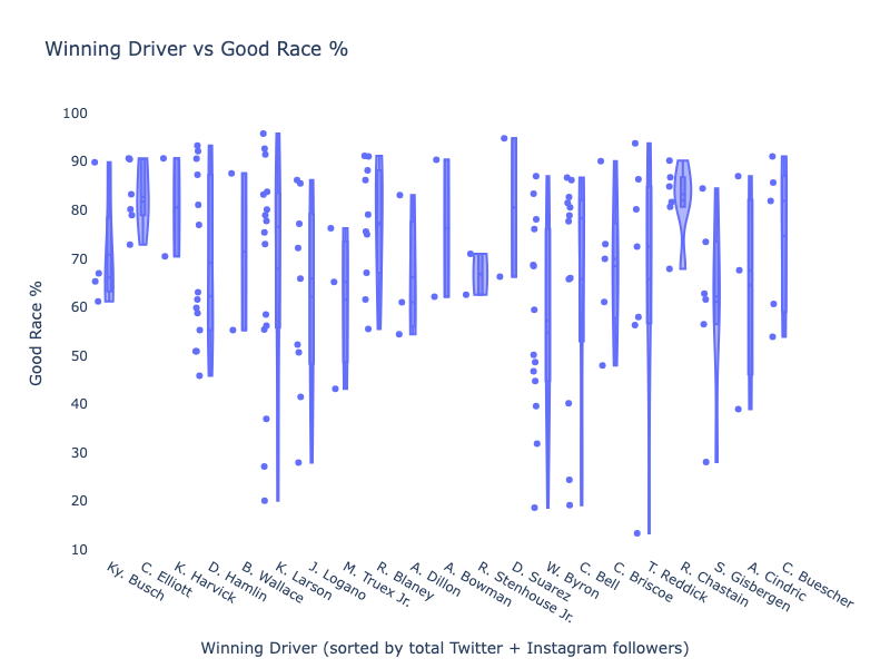
The only drivers who stand out at all are Chase Elliott and Ross Chastain, who have good race poll result clusters above 80% with one outlier each markedly below but still largely positive. Chastain’s outlier is the Phoenix Championship race in 2023, and is likely more representative of the championship finish than his race finish. For all other drivers, the results of the Good Race Poll for races they win vary widely. I don’t see a strong relationship between drivers and poll results.
Finally, let’s look at tracks. This chart is the same format as the driver’s chart, and I’ve grouped tracks by type4 and grouped Chicago with Road Courses and Bristol Dirt with Short Tracks to keep things simple.
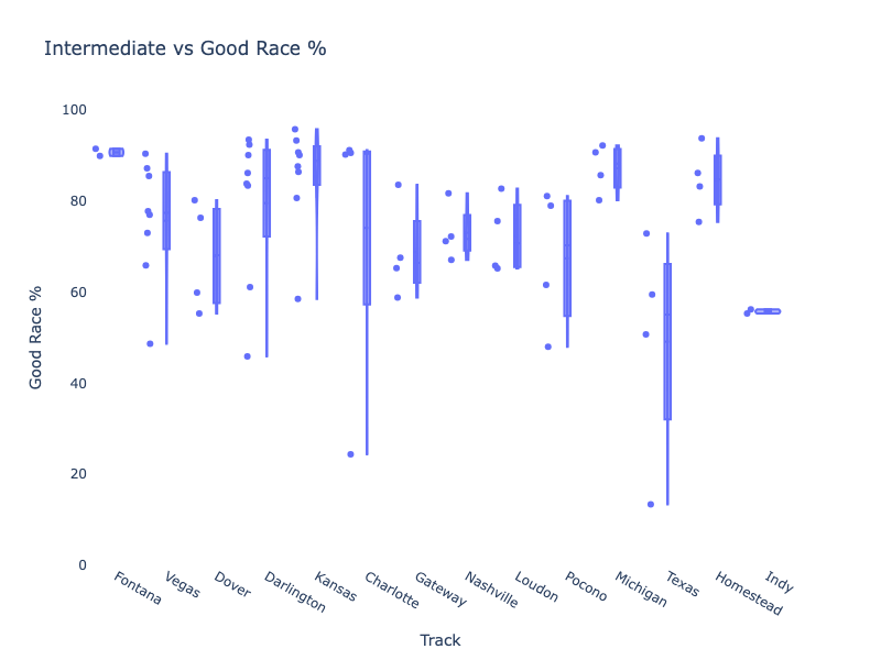
First up, Intermediates, we of course must mourn Fontana, as the track with the highest average above 90%. For most tracks, the results tend to cluster relatively closely together – Charlotte’s outlier is understandably the rain-shortened ’24 race. Texas also has a wide spread, with the ’22 race the lowest of the bunch at 13%. Otherwise, Intermediate tracks tend to average around 80% in the Good Race Poll.
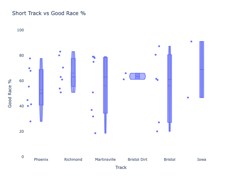
Short tracks demonstrate much wider spreads across the board. Phoenix, Martinsville, and Bristol each have results below 40%. Bristol’s two highest results come from the high tire wear races of Spring ’24 and Fall ’25. I’m somewhat surprised by Richmond’s tighter cluster with an average result of 66%,
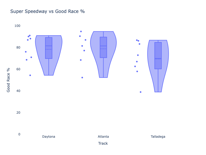
Super Speedways exhibit reasonably tight spreads, with only one result (Spring ‘Dega ’25) below 50%. As much hate as NextGen Super Speedway racing gets, it’s not reflected as clearly in the poll as frustration with NextGen short track racing.
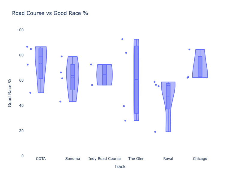
The Road courses exhibit a moderate distribution of results. COTA and Sonoma both have one result each at or below 50%, while The Glen has a wide spread. Unsurprisingly, the Roval is the lowest of the Road Courses, with no results above 60%.
What to make of all of this data? I don’t see an obvious predictor of Good Race Poll outcomes, though tracks tend to be more predictive than anything else. We, of course, shouldn’t be particularly surprised by this, as if Jeff and Jordan’s predictions are anything to go by – it’s tends to come down to the last few races to decide the champion.
- Lixar has since been acquired by BDO and is now BDO Digital – https://www.bdo.ca/about/news/bdo-lixar-is-now-bdo-digital ↩︎
- I would also love to use the full rankings/results of the Most Popular Driver Award for each year, but that data isn’t publicly available – at least not that I could find. ↩︎
- Kendall’s tau looks at whether two variables move together in a reliable direction, but it does so by comparing how every pair of data points ranks relative to each other. Instead of caring about exact numbers, it simply asks: when one value is higher than another, does the corresponding value tend to be higher too? That makes it extremely stable when the data is noisy or when a single race has a huge outlier that would normally skew other metrics. If the rankings mostly line up, tau will be near +1; if they consistently go in opposite directions, it moves toward –1; and if there’s no real pattern, it will sit near zero. It’s especially useful when the relationship isn’t a straight line but still has a clear directional trend. ↩︎
- Feel free to quibble with my categorizations ↩︎
Leave a Reply